
Percolate is a SaaS Content Marketing Platform (CMP) used by global brands like Google, GE, Bosch, and Microsoft. I led the UI design for 'Percolate Next,' a complete front-end redesign aimed at improving usability and streamlining workflows for marketers.
Duration
4 months
Role
Principal Product Designer
Problem overview
Percolate is a Content Marketing Platform (CMP) used by global brands like Google, GE, and Microsoft to manage and centralize upstream marketing processes, from planning to approvals. In 2018, Percolate began a major transformation to support complex organizational structures and introduce team-focused collaboration features. This project, branded "Percolate Next," included a full UI redesign to improve usability, streamline workflows, and modernize the platform for enterprise users.
Existing challenges
Why it mattered
Introducing the new teams model wouldn’t be enough on its own. The above issues threatened client retention and limited platform adoption. With competing platforms like Optimizely, and Sprinklr delivering streamlined, user-centric experiences, it was crucial for Percolate to revamp its interface to align with modern usability standards and maintain its competitive edge.
Complex navigation
The navigation system was cluttered, making it difficult for users to locate essential functions and creating confusion between global, app-level, and object-level controls. This resulted in longer task completion times.
Disconnected task flows
Core functionalities, such as comments, tasks, and approvals, were isolated and did not integrate seamlessly. Users had to switch between different sections to accomplish basic tasks, disrupting their workflow.
Outdated aesthetics
The design did not match the modern, user-friendly expectations of enterprise users, leaving them frustrated and perceiving Percolate as cumbersome compared to consumer-grade software.
My role
I was responsible for developing the new information architecture, creating an end-to-end design system with documentation, and making core marketing tasks more efficient through UI improvements. My role also included building a scalable component library in Sketch, and leading collaboration between design and engineering to implement the new UI across the platform.
My deliverables
Simplify navigation
Create a clearer and more intuitive navigation structure that supported the information architecture needed by Marketers to accomplish their tasks.
Integrate core features
Connect essential tools seamlessly to improve workflow efficiency. As well as reduce the number of steps for common tasks
Success metrics
In order to understand the impact the redesign would have, we identified a few key metrics to measure and track following the months after release.

The output
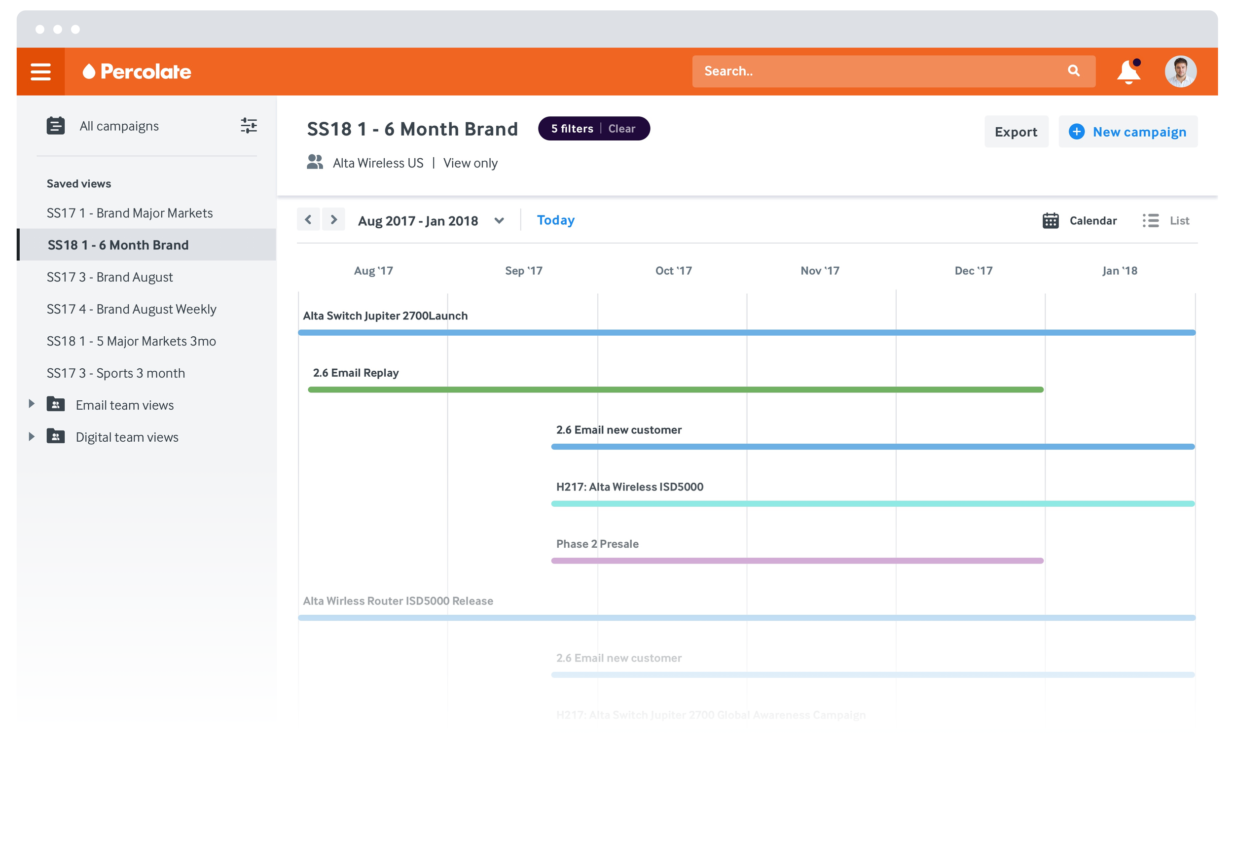
Key product screens spanning the primary applications within Percolate, including campaign creation, planning, digital asset management, and calendars, filter and discovery.
Visual refresh
Implement a modern, cohesive design system and component library that aligns with user expectations for a consumer grade enterprise software experience.


Phase I: Define & Discover
The journey began with a deep dive into Percolate's existing platform, aiming to uncover pain points and carve out a clear path forward. I led an extensive internal audit that examined current features, components, and user flows. What we found was telling: inconsistent use of components and inefficient task flows that bogged down users. These insights set the stage for an impactful redesign.
Understanding the broader landscape was crucial, so we looked beyond our product. Our team researched competitors and top enterprise tools, pulling lessons from their successes and pinpointing best practices. This gave us a clear benchmark and helped shape our strategy for simplifying navigation, crafting a unified visual system, and elevating the platform's usability.
The most illuminating part came when we reached out to the people who mattered most: our users. Partnering with key clients such as EA Games and BP, we conducted interviews with 27 users spanning different roles. These conversations revealed the daily challenges they faced and the workflow obstacles that hindered their efficiency. Their input proved invaluable, shaping the redesign of our information architecture and highlighting where our UI could make a real difference.
Key Insights:
Make Percolate Actionable: Users needed clearer visibility into their tasks and team activities, without being buried in complex navigation.
Usability Standards: Users expected a consumer-grade experience that was seamless and enjoyable, even in an enterprise setting.
Feature Integration: Core functions—comments, tasks, and approvals—needed to be interconnected, simplifying user journeys and eliminating redundant steps.
Guiding Principles:
Streamline task-related actions.
Clearly define global, app, and object-level controls.
Use progressive disclosure to keep users focused without overwhelming them.
Phase II: Design Exploration
Armed with insights, we transitioned into the exploration phase, transforming what we learned into tangible solutions. The first task was a complete overhaul of the information architecture. I took the lead in redesigning the primary navigation, stripping away outdated features and introducing platform-wide search to empower users to find what they needed faster. The user menu was restructured for better access to key settings and account options, solving navigation confusion that users had voiced during our research.
Efficiency was key, so I focused on streamlining task flows. Whether it was setting up a campaign, creating content, or managing approvals, I aimed to cut down the number of steps needed, reducing redundancy and making processes smoother. This shift made marketing tasks faster and more intuitive.
To ensure we were on the right path, I created interactive prototypes and led think-aloud testing sessions where users could navigate new flows and interactions. Their feedback was instrumental in validating our choices and led to fine-tuning of details such as button placement, micro-interactions, and labeling.
Phase III: Detailed Design
As the design exploration solidified, we moved into high-fidelity design. Using Sketch and Zeplin, our team produced detailed assets, applying a consistent visual language across the platform.
I developed a comprehensive visual design system with an accessible color palette, standardized spacing rules, and a type hierarchy that made the interface readable and cohesive. This design system wasn't just for the current project—it was built to be scalable and set a foundation for future work.
The component library I built standardized UI elements like navigation bars, buttons, and data tables. This library allowed engineering to apply our designs efficiently and maintain a consistent experience across the platform.
😎 I wrote this blog post about the design system!
Phase IV: Development Support
Close collaboration with engineering was a constant throughout the project, ensuring no surprises when we reached the build phase. I facilitated a smooth design handoff by uploading high-fidelity designs to Zeplin, where engineers could access specs and guidelines. Regular design reviews kept everyone aligned, and I worked closely with the team to address feedback and adapt components as needed for technical feasibility.
Engineers created demo environments that allowed us to test how the design translated to live code. I meticulously reviewed these implementations, filing bug reports in JIRA with annotated screenshots to help engineering quickly address any discrepancies, ensuring the final product met our high standards.
How we got there
Impact
On customers and the business
The launch of Percolate Next was transformative. Task completion times dropped significantly, and user engagement soared as the new IA and UI made navigating the platform more intuitive. Integrated features worked seamlessly together, streamlining workflows and enhancing user satisfaction. The redesign received industry-wide recognition, scoring a 5/5 in design ratings and reinforcing Percolate’s reputation as an innovative leader in enterprise content marketing.

Team
WORKING TOGETHERBuilding a product of this scale truly takes a village. I was fortunate to work alongside a talented team of designers, engineers, and product managers who made this journey possible. Here are a few key contributors.
Design Team: Anne Birzin, Keith Price
UX Research: Lucia Cozzi
Tech Leads: Max Kastow